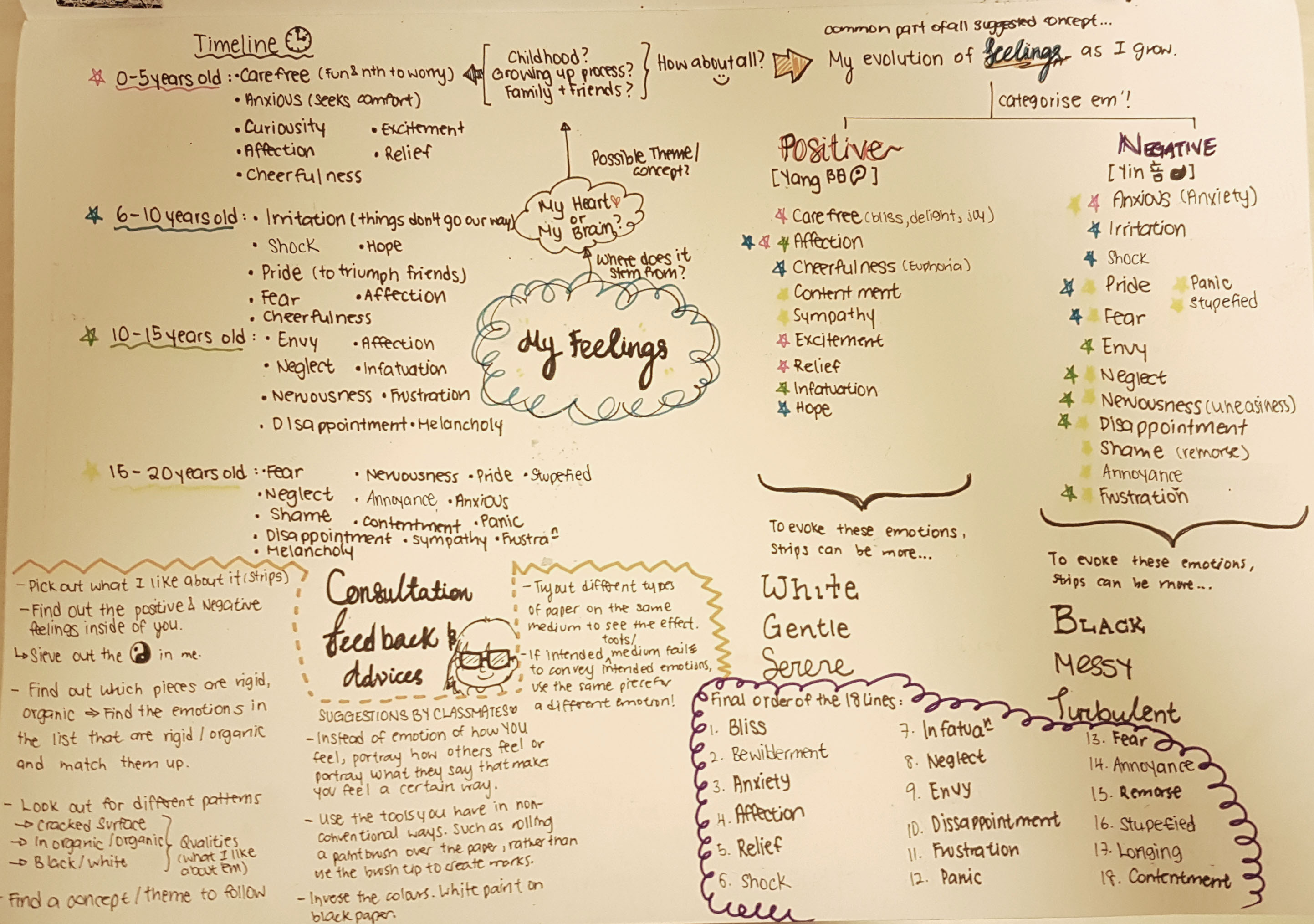
“Emotion. It starts out small, but it grows.”
I suddenly came up with this quote while I was brainstorming for this project on my 2D sketchbook, and I find this very relatable to my direction into mark making. Little or undeveloped emotions are categorized into primary emotions when we are young, and it has become more evolved and complicated as we grow.
Concept
To document the myriad of emotions categorized into Positive and Negative emotions experienced while growing up.
Approach (towards the whole project, materials used, things tried)
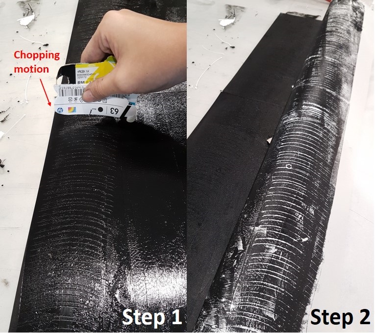
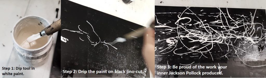
My Approach towards the whole project is just freely experiment with everything and anything! I didn’t want to hold myself back by constraints, so I totally let myself go and immerse myself in the world of mark making while channeling my inner Jackson Pollock to assist my spontaneity! 🙂
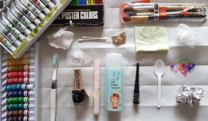
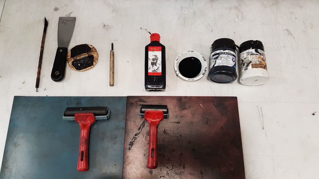
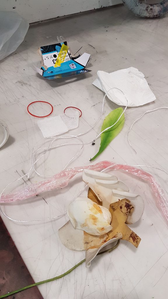
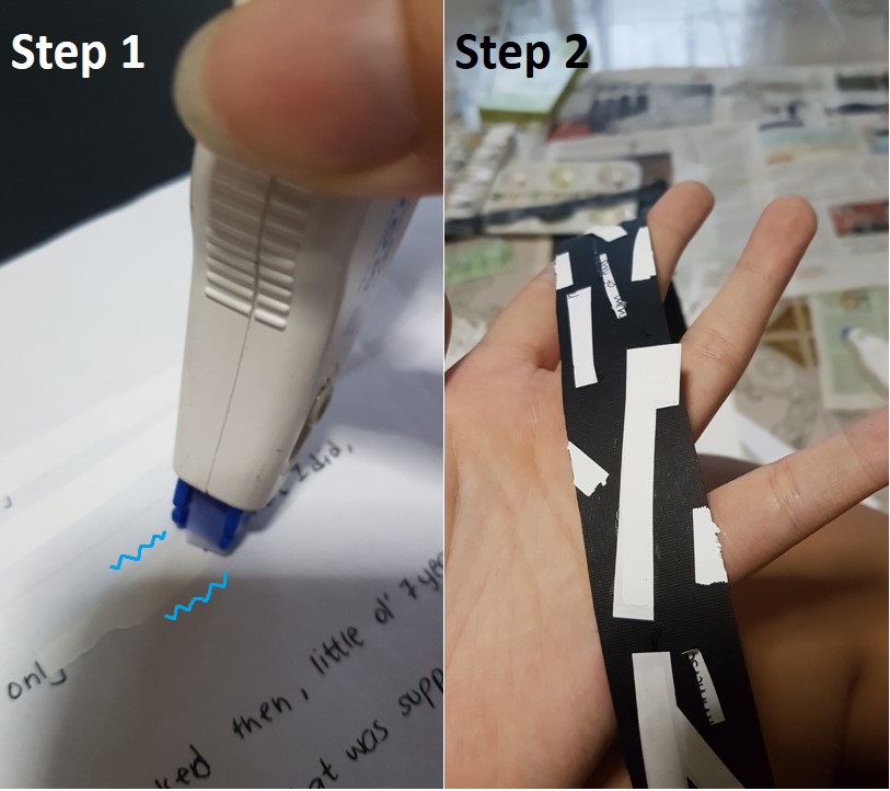
Materials used are nail polish, nail polish remover, water color, eyeliner, salt, acrylic paint, Chinese ink, mono-printing ink etc.
Mark making tools that I have tried are a wide variety. For instance…Tools used in Kitchen like Clingwrap, rubberbands, foil, toothpick, chopsticks, spoons etc. Things in First Aid Kits like crushed pills, cotton buds, cotton pads etc.
(More information of tools and materials I’ve experimented with are heavily documented in my previous posts! :))
Highlights of the works
Sequence of lines arranged on board are in the sequence of my emotions as I grow up.
First Board
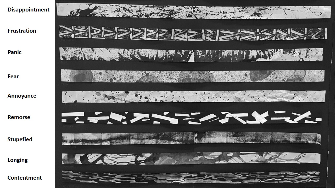
Second Board
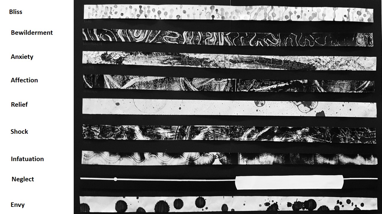
~~~The flowing emotions below are categorized into ‘Primary emotions’ and do not represent the order of the 18 strips in the above images~~~
(JOY)
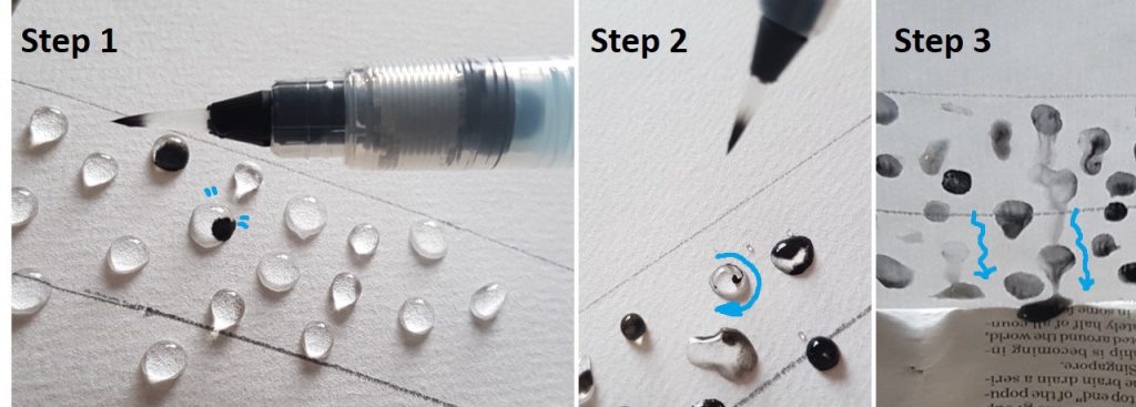
Bliss – Inspired by rain droplets on the window shield during a heavy downpour, the white noise is soothing to me. The flow of the lines created by gravity is soft and flowing.
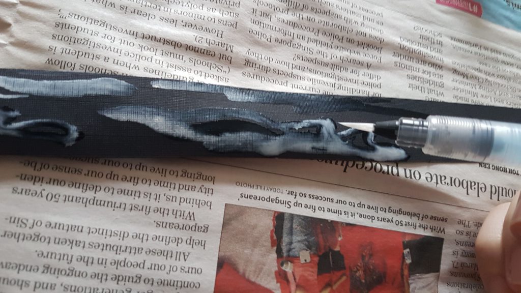
Relief – This piece is actually a flip side of the paper I used for the creation of the ‘Fear strip’. There is lesser black and coagulation of black bubble marks on the other side of the paper. Just like sometimes when fear is just all in our head, we just need to look on the ‘flip side’ to see that fear is actually all in our head.
Contentment- Inspired by the calm and tranquil reflection on the lake, I am at the state of satisfaction and happiness. Strokes are soft and fluid which exhibits comfort.
(LOVE)
Infatuation – Like an intense but short-lived passion for someone, there are short frequent ups and downs. Lines are curved to evoke fluidity. Whiteness fades off towards the end to show infatuation fading off.
Affection – Tools used to create marks are soft and as the purpose of healing. Tissue used to wipe tears, and cotton mesh pads used to stop bleeding injuries.
Longing- A yearning desire to be cherished. Tone of black, the representation of yearning desire, varies at different stages and spreads in different directions that is not within my control. Spreading and tonal value of lines fade off towards the end to represent the wearing off of the desire.
(FEAR)
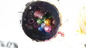
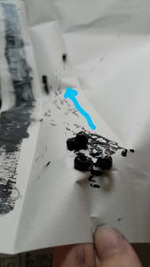
Fear – Coagulation of different sized black spots that takes up a lot of space. Just like fear itself that takes up unnecessary space.
Anxiety – Layering of black on white on black again, anxiety is to me is full of ‘what ifs’. The cracking of black and swirling mixture of black and white reveals the under layer of white shows that it is breaking one apart, and how swirling thoughts consume me slowly.
Panic – A dark and heavy base with sharp pointy lines pointing upwards, like panic which grows because of a strong heavy reason that weighs one down.
(ANGER)
Frustration – I wanted to created a perfect systematic pattern of angular lines. But an accidental mistake such as over estimation, messed up my pattern, which further emphasizes my frustration that my attempt to achieve perfection is ruined.
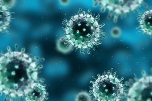
Influenza Virus
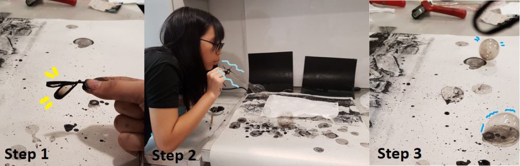
Envy – Splotches resemble influenza viruses which spreads routinely amongst people. You would not identify Flu easily until you’ve experienced the symptoms. Similarly, one wouldn’t realize they are envious of someone until they’ve experienced doing things out of the ordinary.
Annoyance – Different tonal values of black was a result of different ratio mixture of mediums. Aggressive marks are created by whacking a damp paintbrush in mid-air to achieve splatter patterns. Different tonal values of black ink symbolizes the extent of the issues I was annoyed about. The darker it is, the more serious, and the size of splatter represents the amount of issues I was annoyed about.
(SURPRISE)
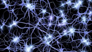
Transmission of nerve impulses along neurons.
Shock – Vigorous expressive lines with narrow spreading lines , like transmission of nerve impulses travel along neurons when one goes in shock.
Stupefied – To be put overwhelmed to the state of being incapable of any responsiveness. Black lines across the strip represent the state of constant astonishment. Similar to the TV static, and very fine details surround the line like noise.
Bewilderment – Vigorous movement of the flowing lines create a sense of confusion. Like a maze or tangle of lines. Lines get thinner towards the end to show the increase in fragility as more darkness overwhelms the lines.
(SADNESS)
Remorse – Correction tape on written words shows a mark on the surface if you look closely enough. Attempting to remove errors but marks are permanent, as much as we try to conceal of fix it. Damage has already been done.
Neglect – Tried to create 3 Dimensionality on a 2D platform by introducing space. Placed a small circle on the extreme left and a close up view of a very large circle on the right to create depth. Intended to create a line of perspective to show the physical distance between 2 circles by adding a horizontal line at the back to act as the background.
Disappointment – Wanted to create happy marks with a tool that brings me happiness, but ended up getting something distressful. Hence, disappointed when my expectations are not met.
Challenges faced & how I’ve addressed them.
- Certain emotions I want to convey using a specific item did not turn out the way I want them to. Hence, solution to that was to reuse the strips that convey a another feeling I felt upon looking at the final mark.
- I find it frustrating that I couldn’t focus on conveying my emotions into my mark making techniques as I was very restrained by how aesthetically pleasing it should be. And my solution was to do mark making in a way that I would not be able to see the final product as soon as I begin, as I would worry how it looks before I even end. So I would suggest closing my eyes as I proceed, only revealing the final product to myself when I am done (Like blind contouring in Foundation Drawing class!).
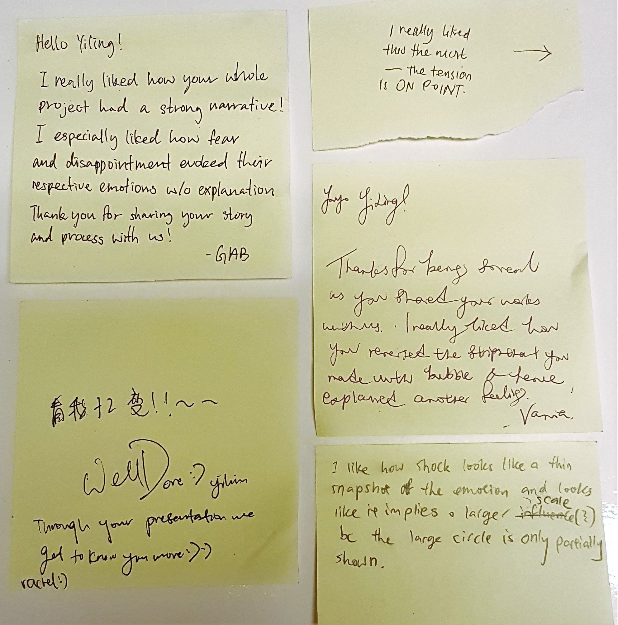
Comments given by my classmates! 🙂 Thanks for the comments! I really like receiving them! 😀
~~~~~~~~~~~~~~~~~~~~~~~~~~~~~~~~~~~~~~~~~~~~~~~~~~~~~~
This concludes my last and final post for ‘(2D) Project 1: My line is Emo’!
Thanks for sticking with me on my journey into mark making! 
Any suggestions for my own improvement or comments, do feel free to comment below!! 😀
Cheers,
Yi Ling.


 The setup (Exposition) consists of the facts the audiences need to know, like the establishment of characters an motive
 YES. I had really high expectations of this movie initially because the male lead was Jason Statham, the actor in one of my all time favorite action movie, ‘The Transporter’.


 ~~~~~~~~~~~~~~~~~~~~~~~~~~~~~~~~~~~~~~~~~~~~~~~~~~~~~~